Rotas Brasileiras
[2022–2023]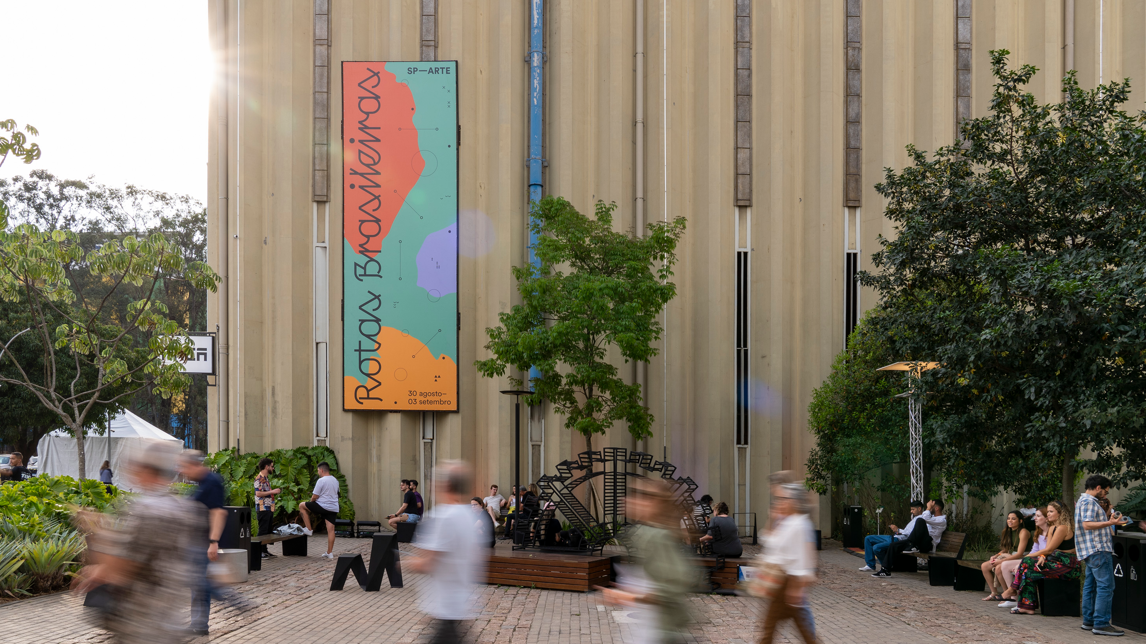
[VISUAL IDENTITY, SIGNAGE, DIGITAL DESIGN, EDITORIAL]
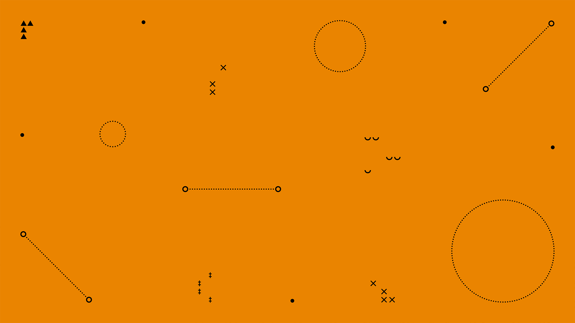
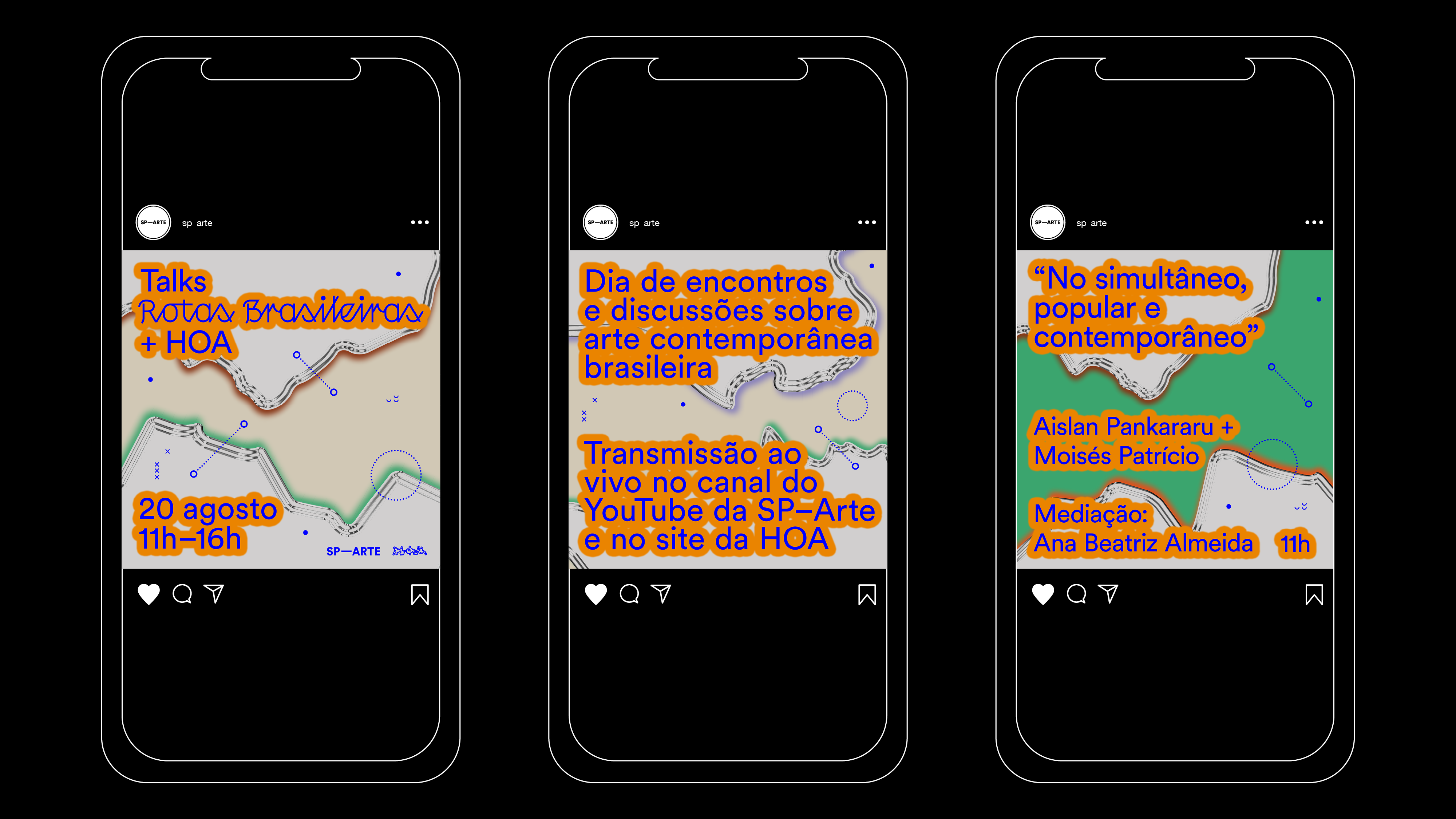
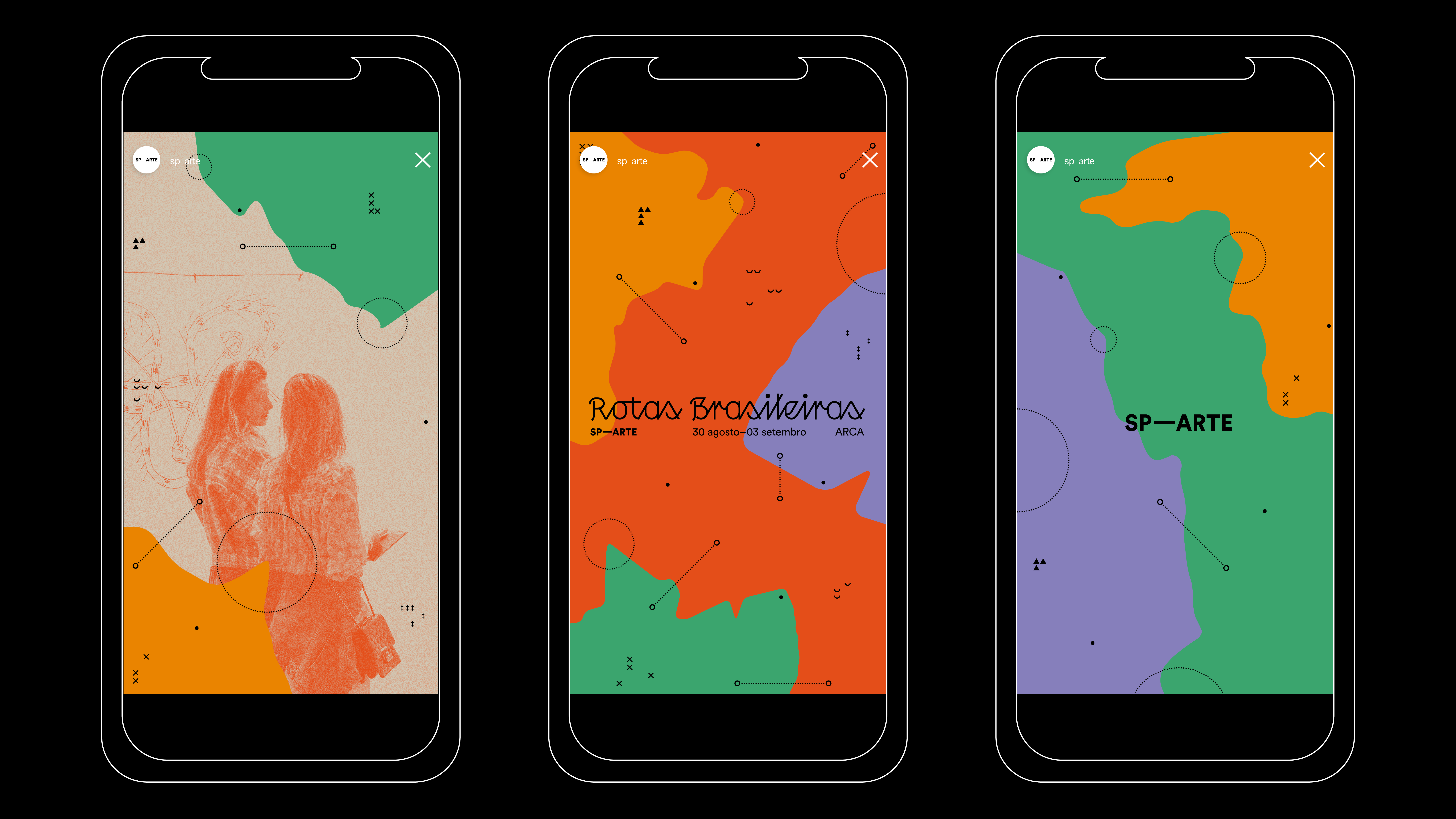
The visual language created for Rotas Brasileiras drew its primary inspiration from a comprehensive study of the Brazilian territory. This exploration covered the country's geographical configuration, including physical features such as rivers, mountains, forests, urban areas, and its diverse climatic conditions. Building on these insights, graphic elements were meticulously crafted to evoke the essence of cartography. A diverse palette of colors was thoughtfully selected to reflect the rich variety found in Brazil.
![]()
![]()
![]()
![]()
![]()
![]()
![]()
![]()
![]()
![]()
![]()
![]()
![]()
![]()
![]()
![]()
![]()
![]()
![]()
![]()
![]()
![]()
![]()
![]()
![]()
![]()
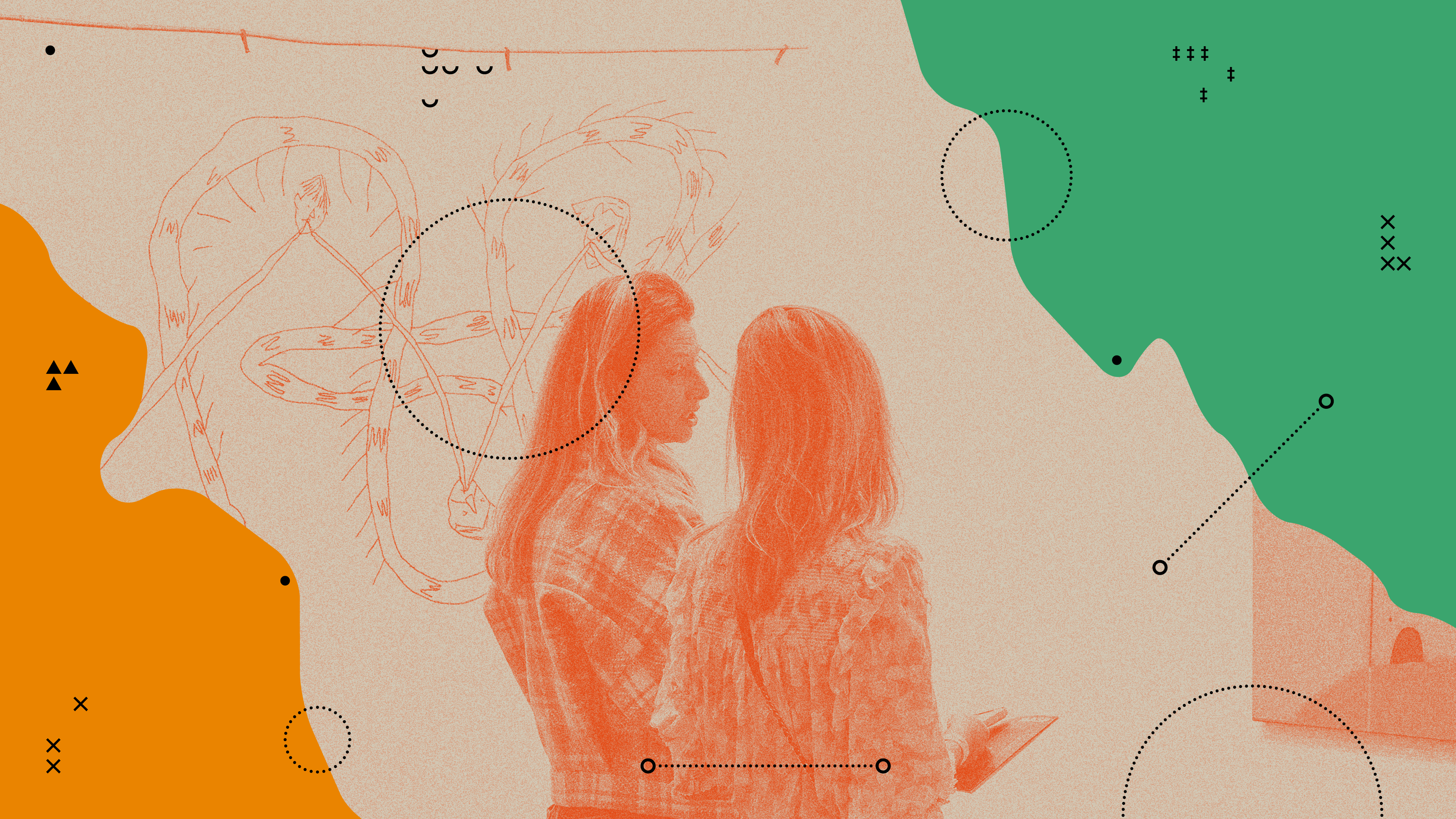
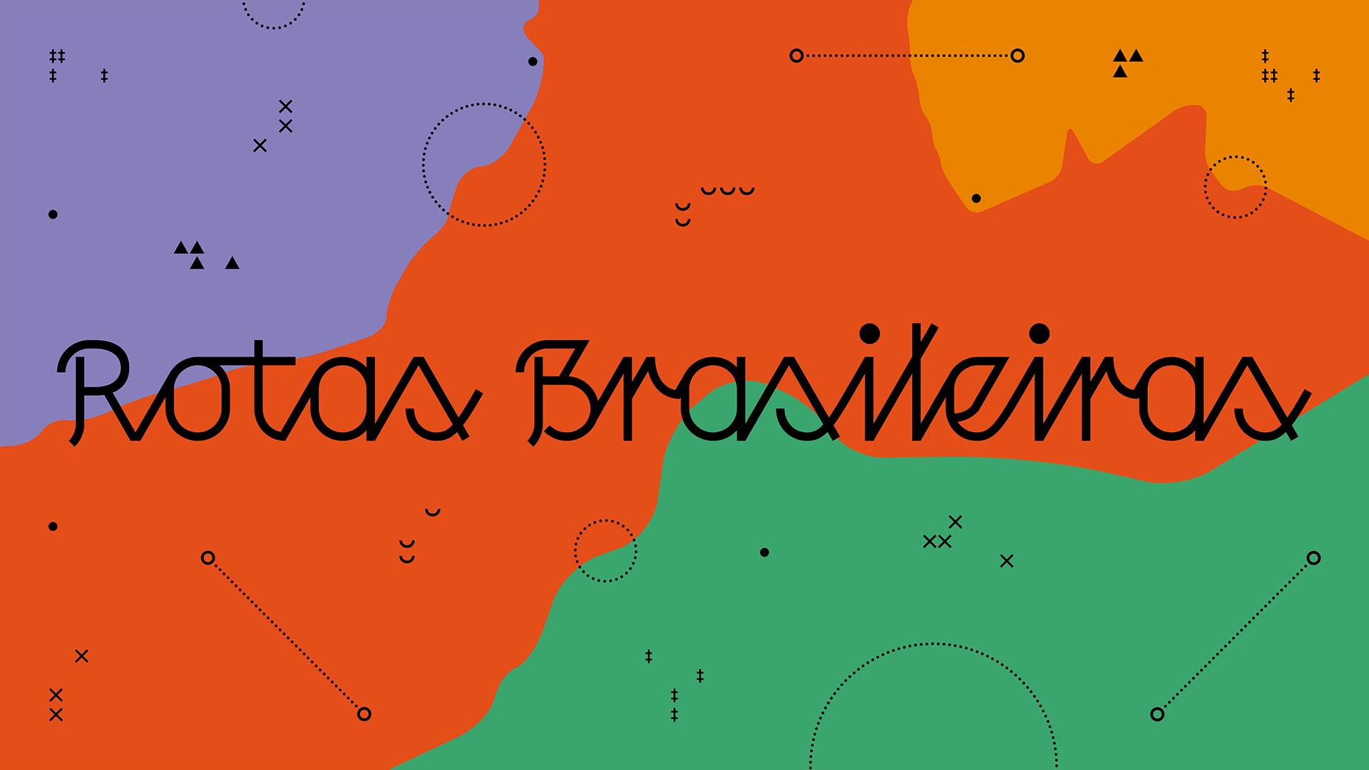
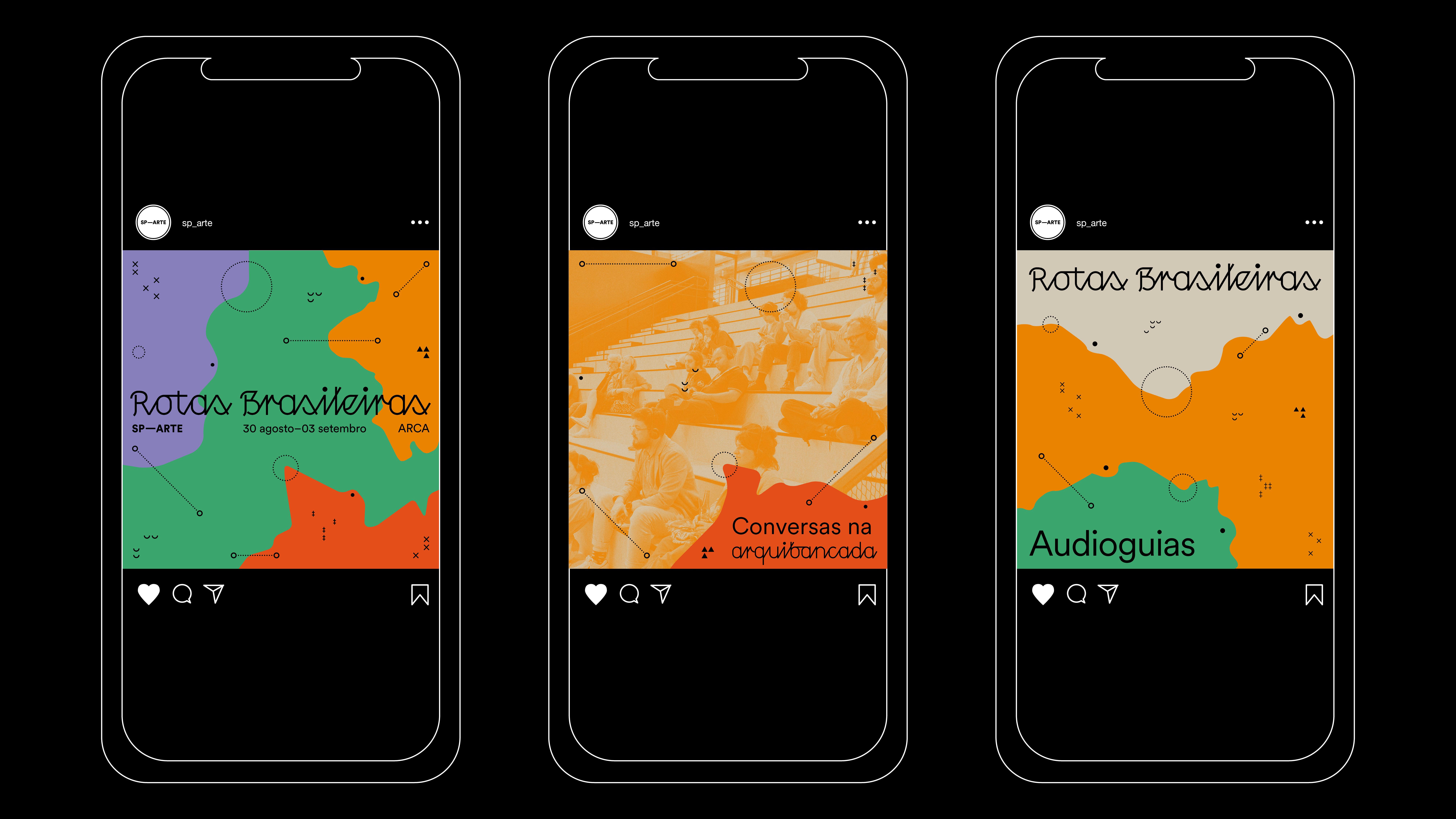
The visual language created for Rotas Brasileiras drew its primary inspiration from a comprehensive study of the Brazilian territory. This exploration covered the country's geographical configuration, including physical features such as rivers, mountains, forests, urban areas, and its diverse climatic conditions. Building on these insights, graphic elements were meticulously crafted to evoke the essence of cartography. A diverse palette of colors was thoughtfully selected to reflect the rich variety found in Brazil.
To complement this design, a typography with a handwritten script-like style was chosen for the title, adding a personal touch and a sense of warmth to the visual identity.