SP–Arte
[2018–2023]
[BRAND IDENTITY, VISUAL IDENTITY, DIGITAL DESIGN, UI DESIGN]
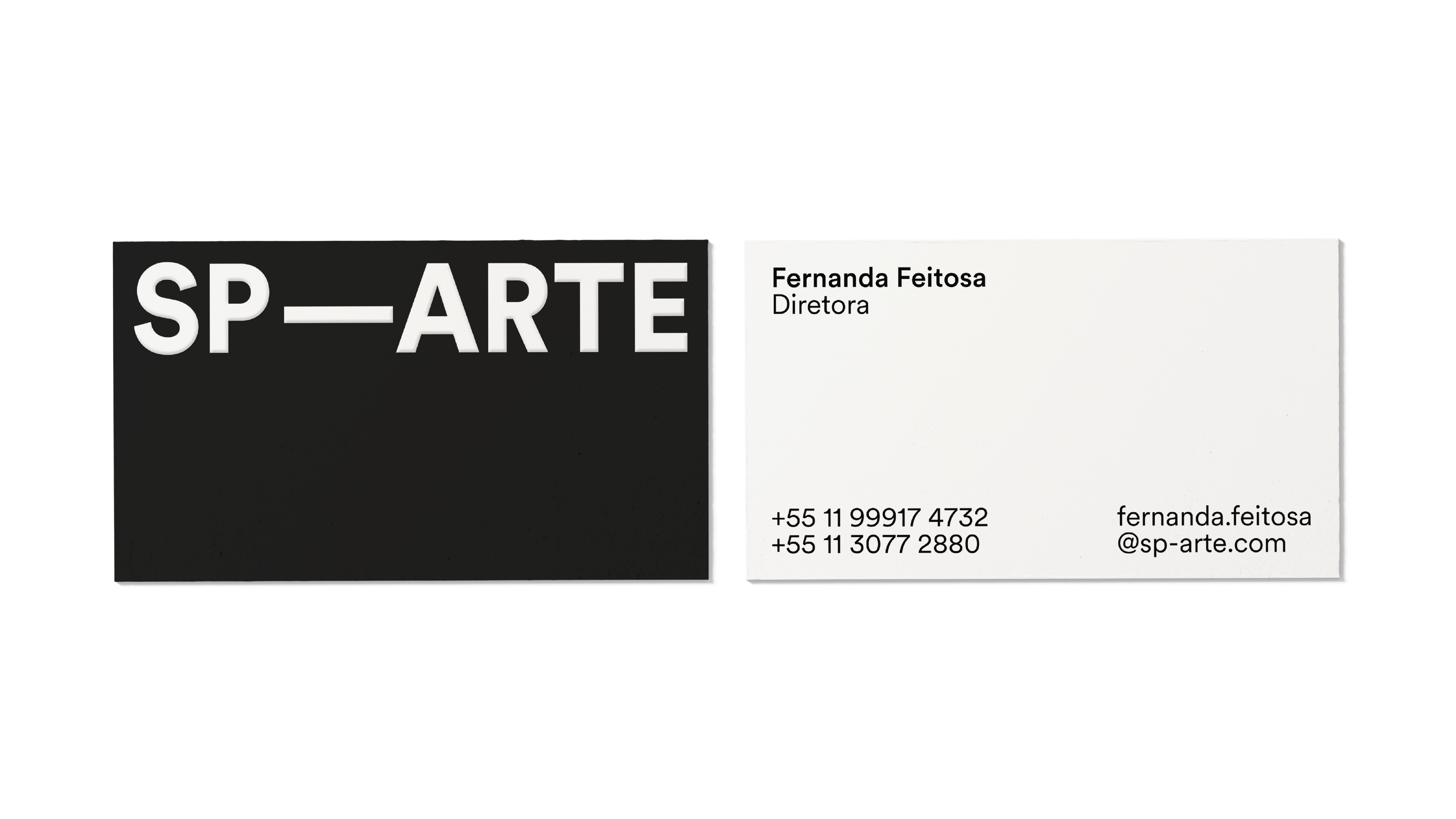
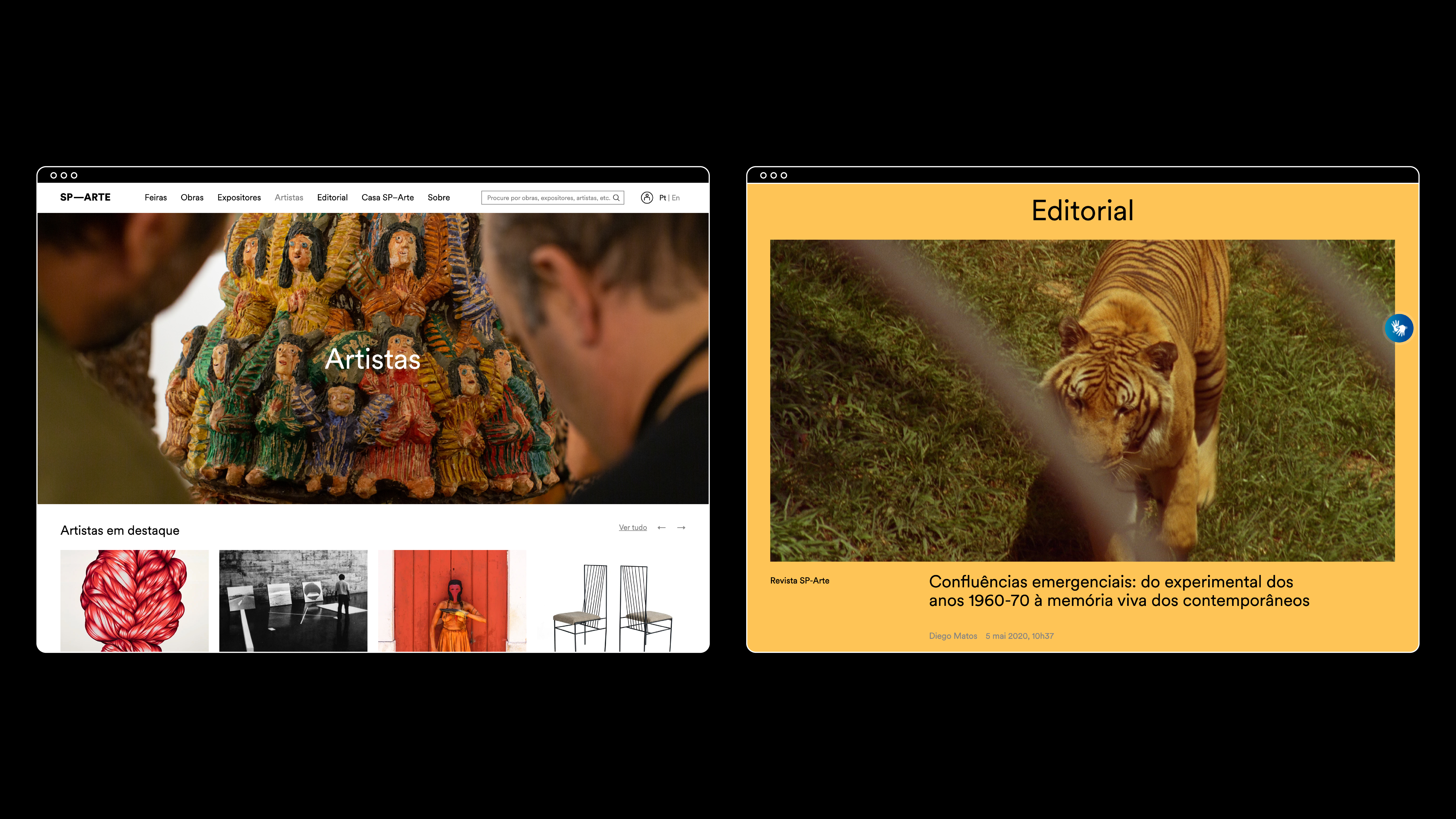
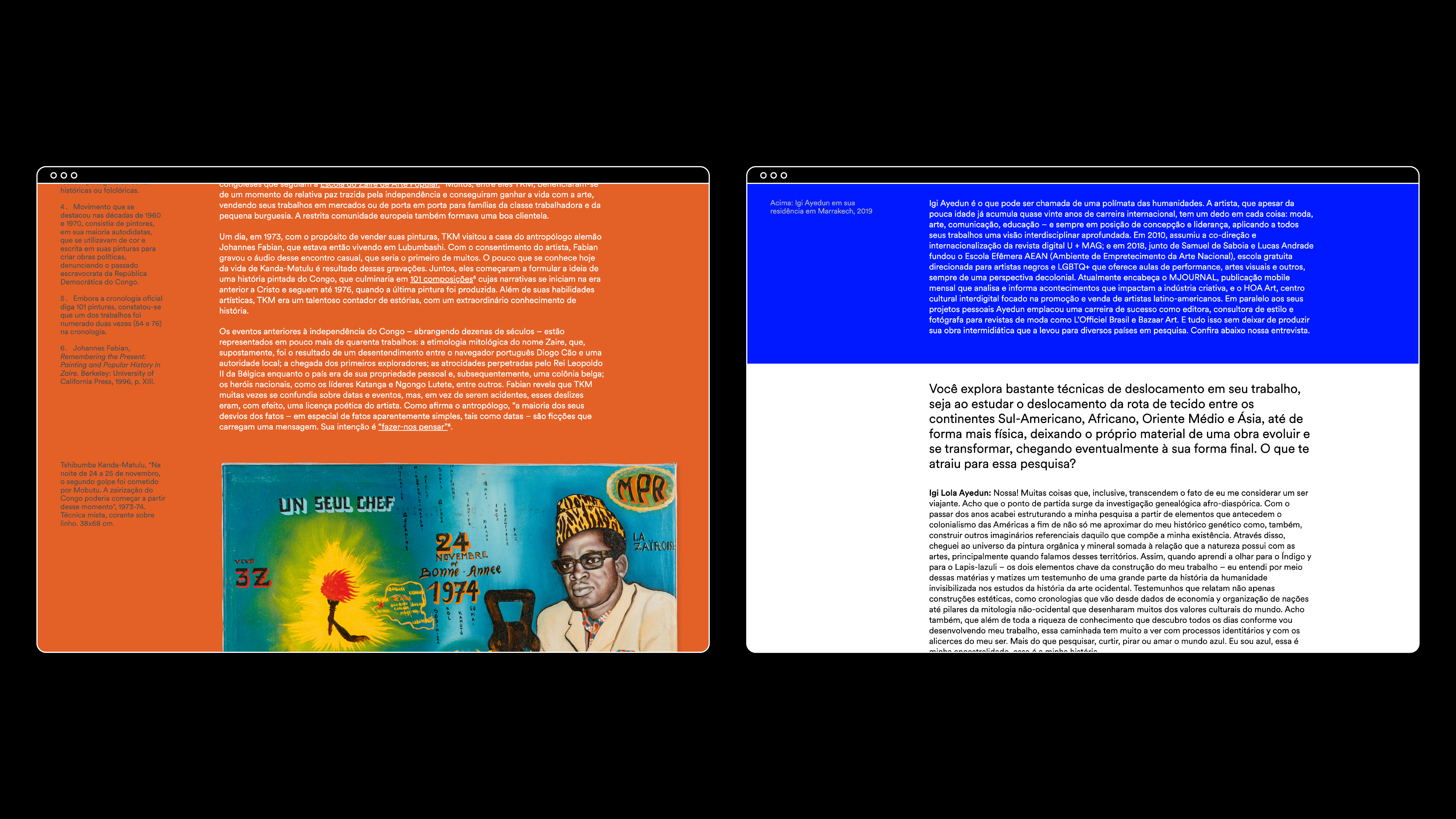
As the largest art fair in Latin America, SP–Arte underwent a significant brand transformation with a focus on redesigning the logo. The strategic enhancements included increased font weight, the adoption of uppercase letters, and a geometric design, resulting in a revitalized brand with a robust visual presence. Since then, this renewed identity has been seamlessly extended across various platforms and mediums, including the website, videos, advertisements, social media, marketing campaigns, printed materials, and event signage. Made in collaboration with Felipe Chodin.
![]()
![]()
![]()
![]()
![]()
![]()
![]()
![]()
![]()
![]()
![]()
![]()
![]()
![]()
![]()
![]()
![]()
![]()
![]()
![]()
![]()
![]()
![]()
![]()
![]()
![]()
![]()
![]()
![]()
As the largest art fair in Latin America, SP–Arte underwent a significant brand transformation with a focus on redesigning the logo. The strategic enhancements included increased font weight, the adoption of uppercase letters, and a geometric design, resulting in a revitalized brand with a robust visual presence. Since then, this renewed identity has been seamlessly extended across various platforms and mediums, including the website, videos, advertisements, social media, marketing campaigns, printed materials, and event signage. Made in collaboration with Felipe Chodin.